Cercle Restaurant.
Challenge
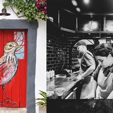
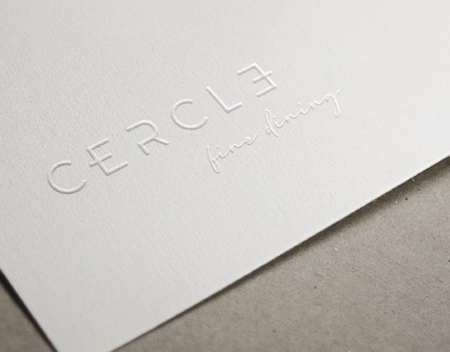
Cercle means "circle" in French. In the development of this new image, we were proposed to design a brand based on lettering and that was not limited to reinforcing the concept of circle, already present in naming, in an obvious way. Thus, our solution was based on using some elements of the letter design to symbolize details related to the restoration and that at the same time reinforced the concept of union, closing the shape on itself, similar to the circle. In addition to the image, stationary pieces, the menu, the website and the creation and management of content for social networks were developed.
Client
Cercle Restaurant
Cercle Restaurant
Service
Corporative image | Web | Multimedia | Digital marketing | Stands | Signage
Corporative image | Web | Multimedia | Digital marketing | Stands | Signage
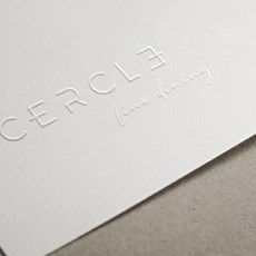
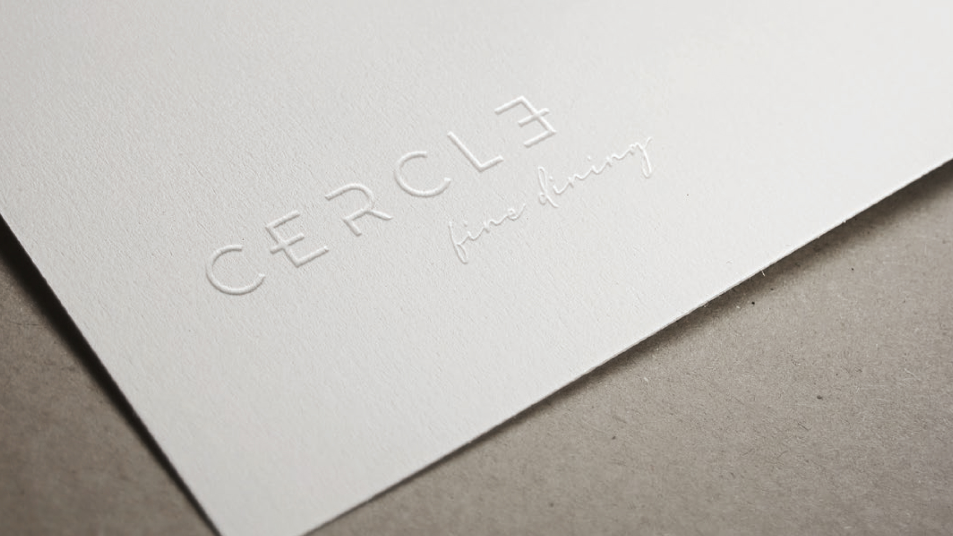 Logotype
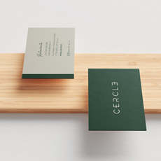
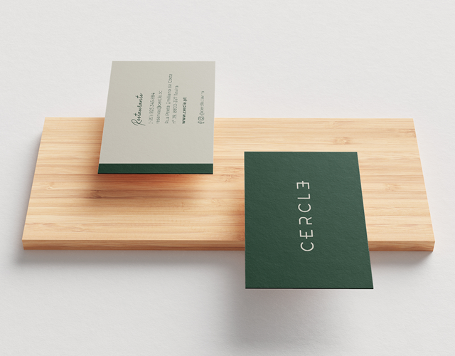
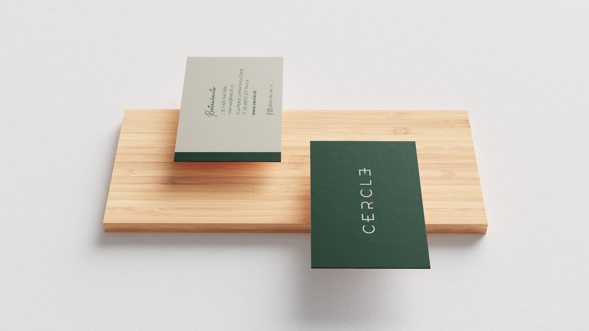 Business cards
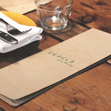
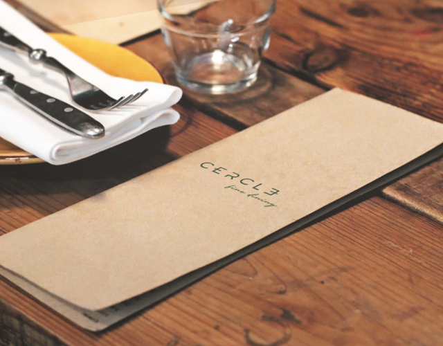
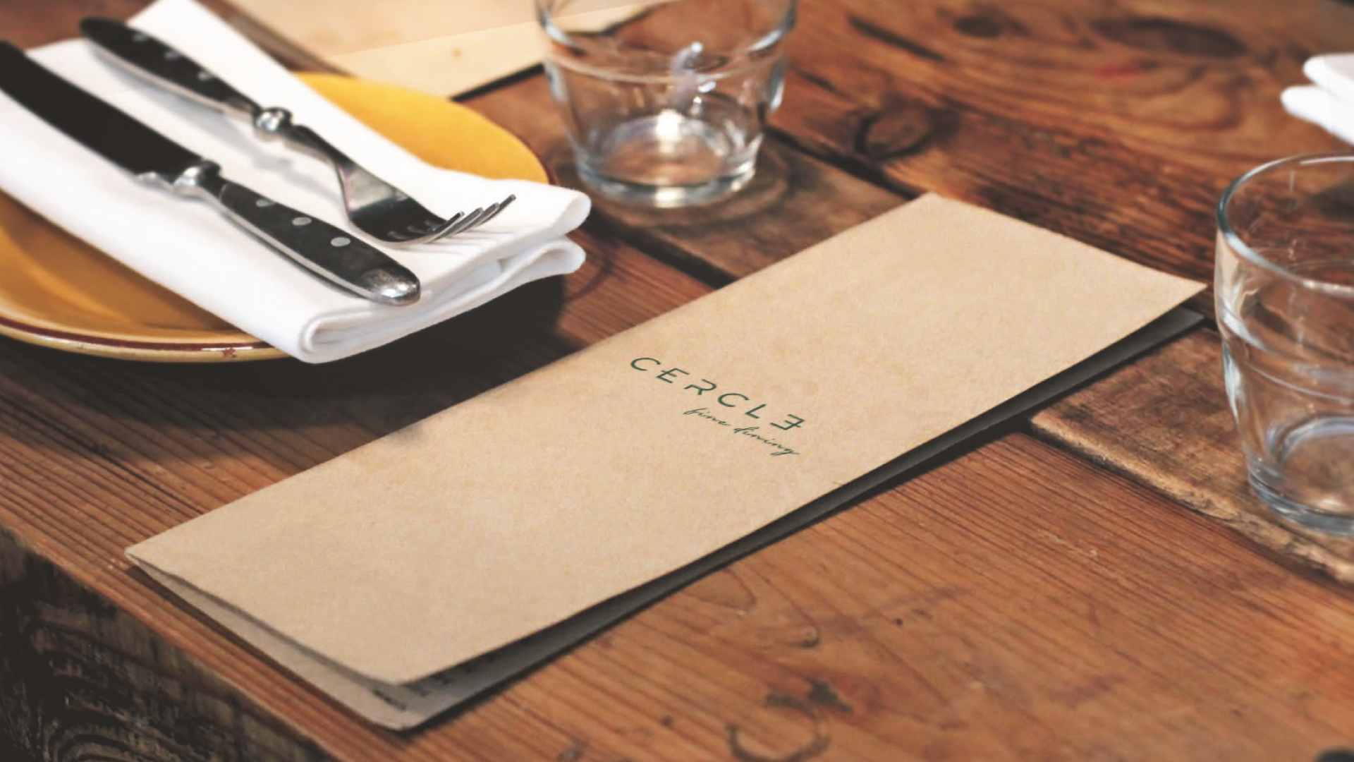 Menu cover
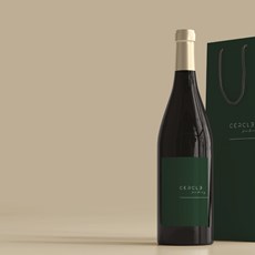
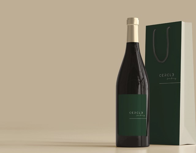
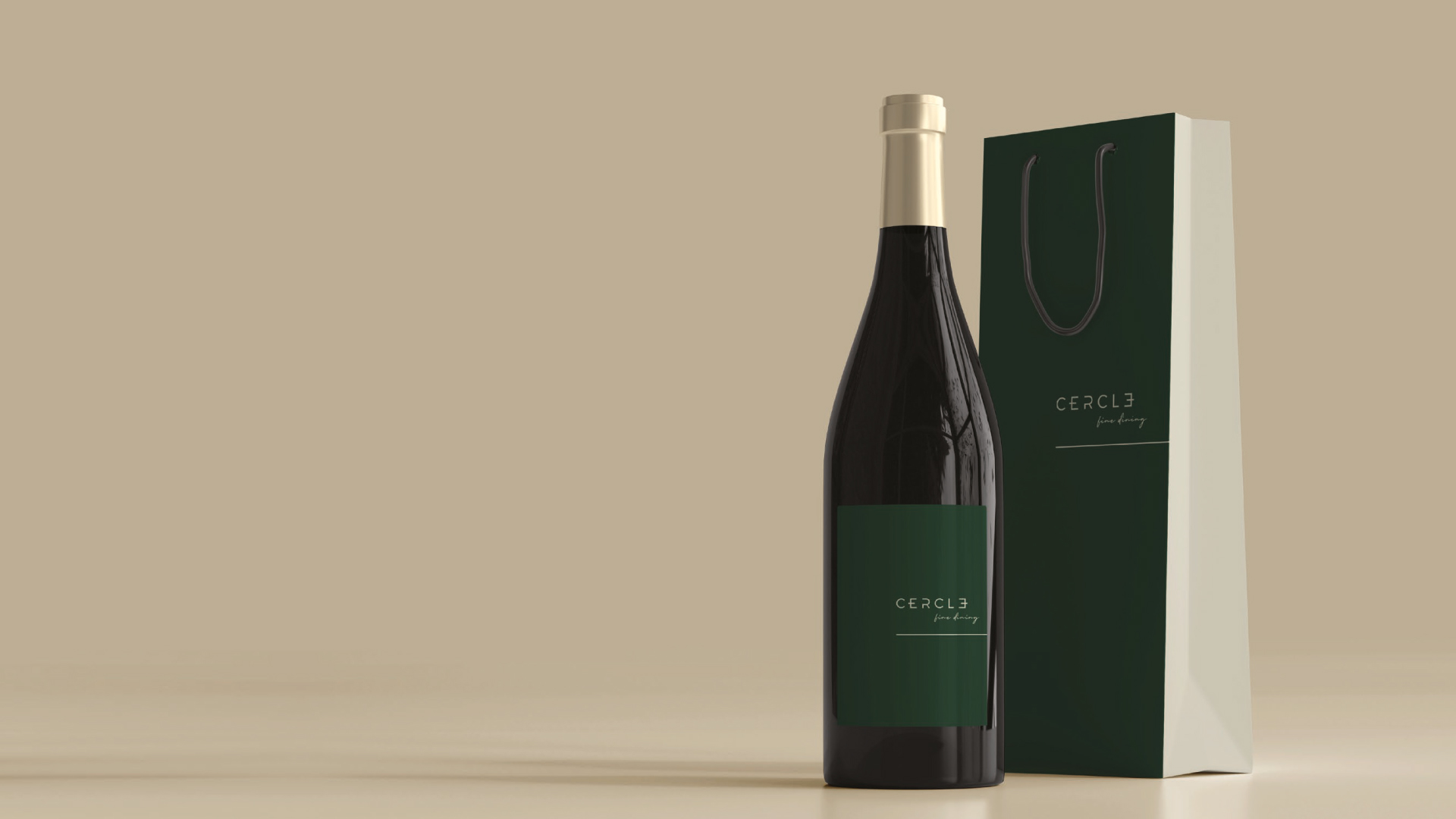 Wine bottle label
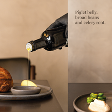
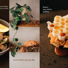
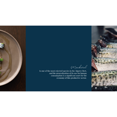
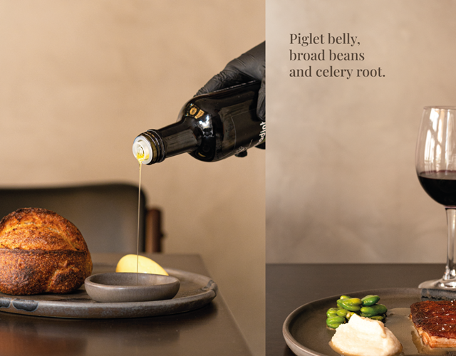
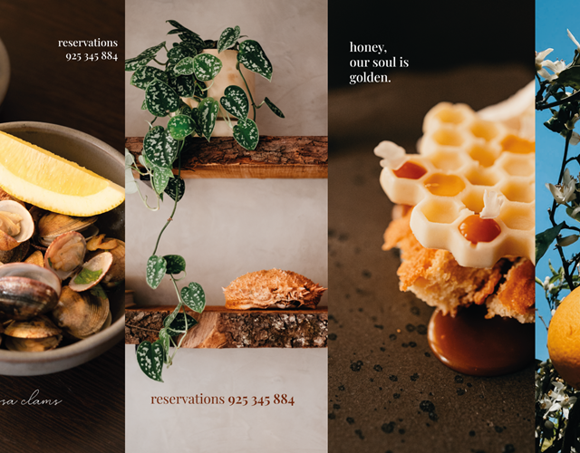
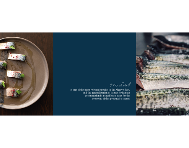
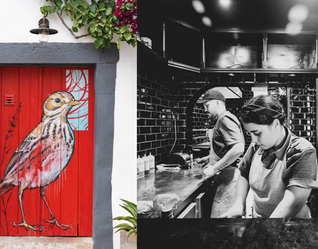
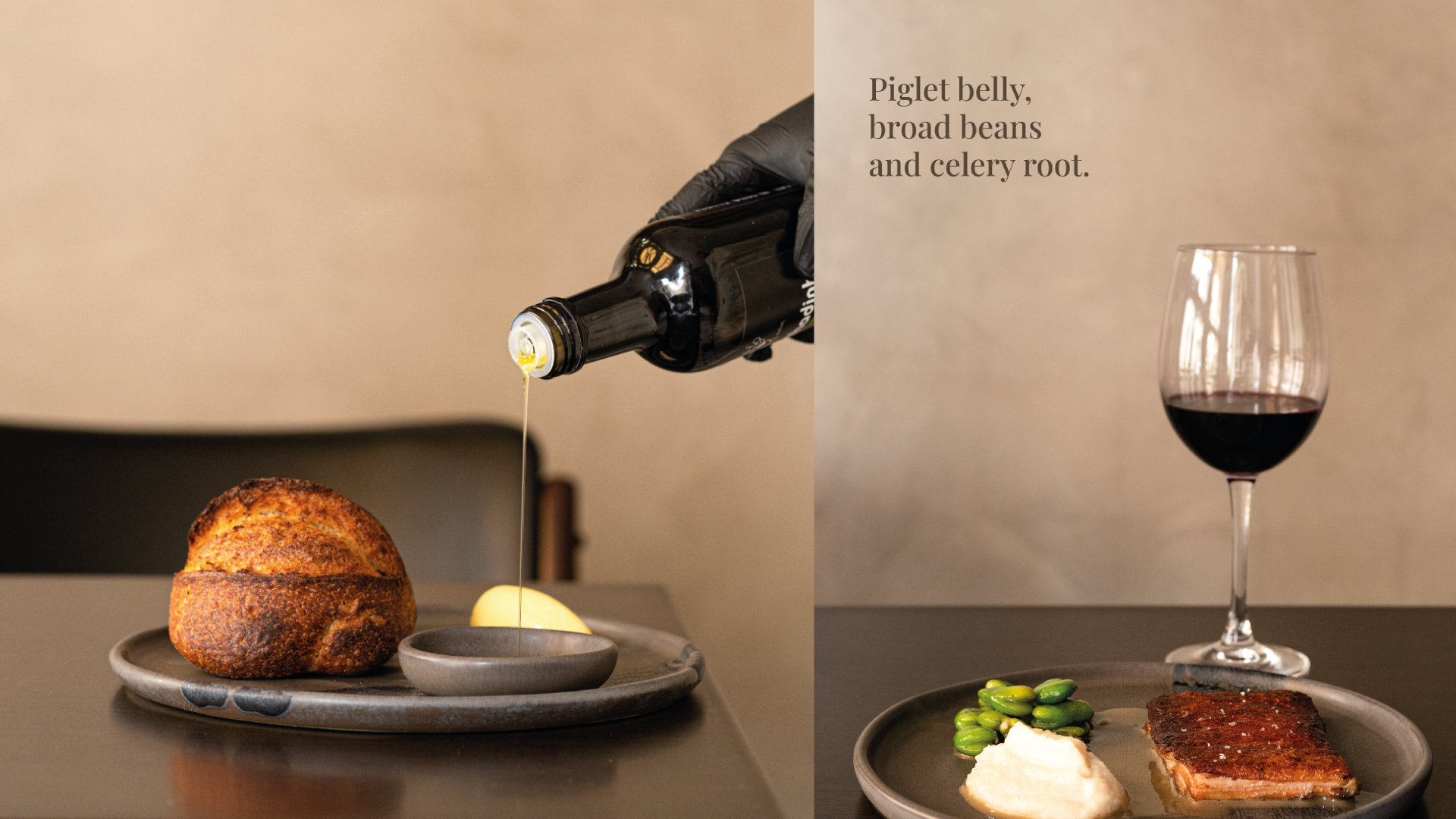 Social media posts
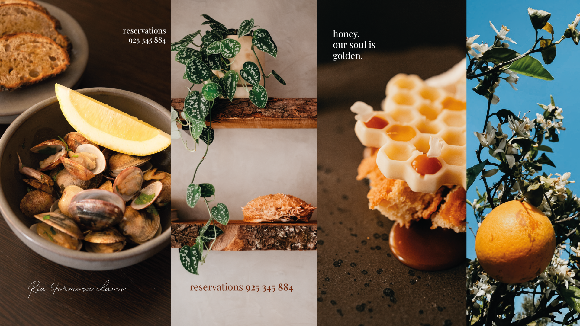 Social media posts
 Social media posts
 Social media posts
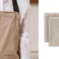
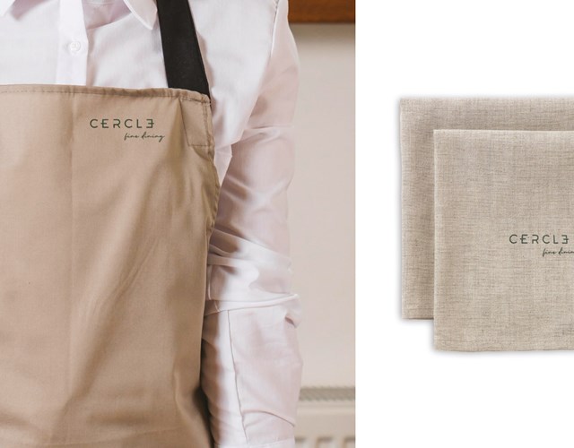
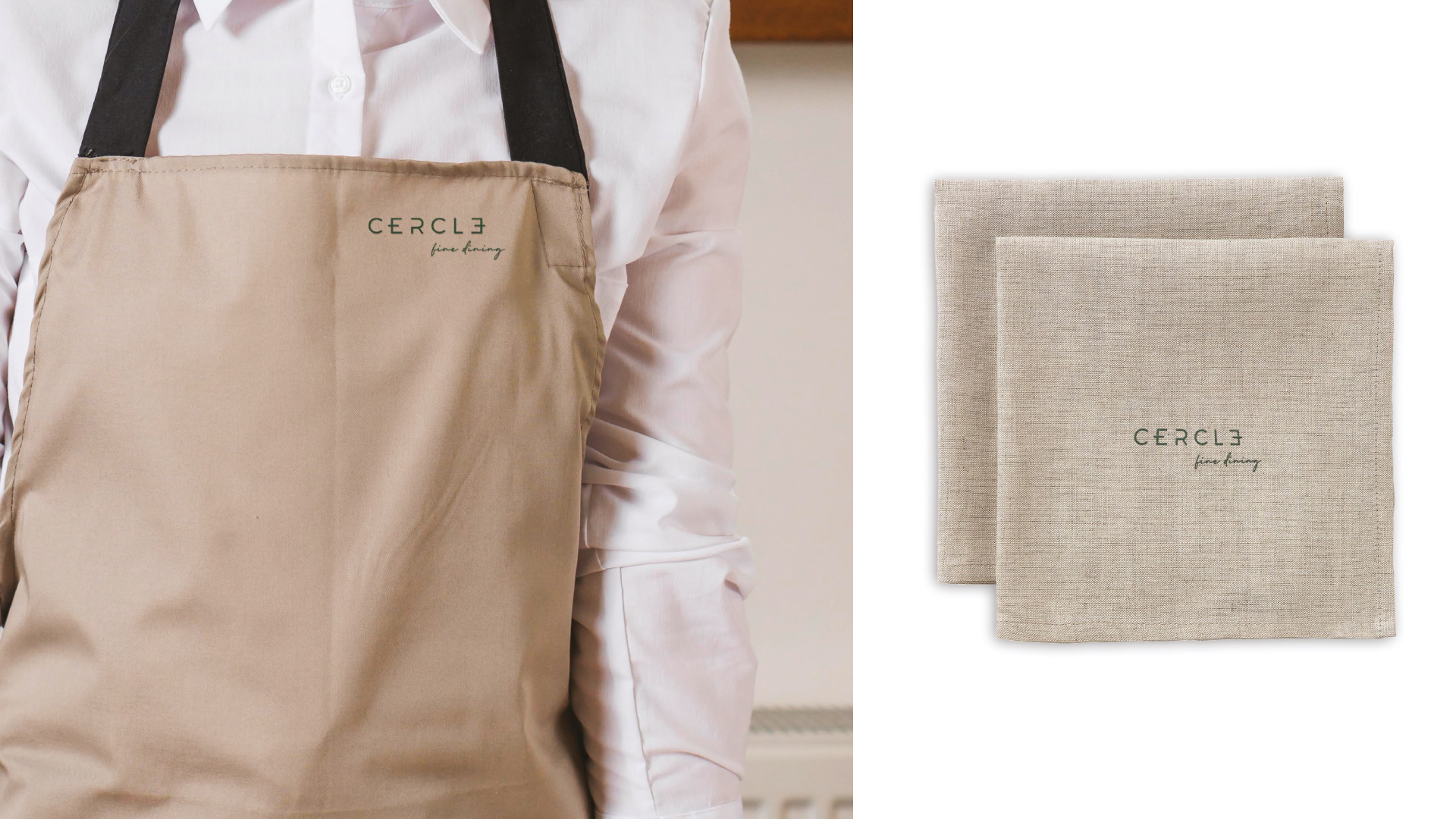 Apron and napkins